VTTKD Club Web Page Mock Up
< Back to Home Page
date completed: 2009.03.21
My Version:
Mike's Version:

Download: Project file
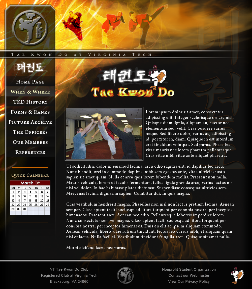
Going back and looking at this mockup about six months later, I can honestly say that this design is too much. There's just way too much going on ... everywhere. There's no place on the page that one's eyes can go to rest. The flame/explosion that's happening in the upper portion of the page was done using a mixture of spaghetti theory and modern art theory. I basically threw images at it until I liked what I saw. Which, in the end, I believe is part of its downfall. It's, quite simply, too busy. Oh well. It wasn't done in the hopes of ever getting used and it only took me a few hours to throw together, so I'm not overly worried about it. Oh, and if you like Mikes more, then we're not friends any more. If you tell me you like Mike's more just to piss me off, then you probably are one of my friends.
User Comments:
Be the 1st to add a comment!