Tattoo Dragon
< Back to Home Page
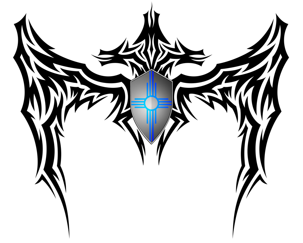
date completed: 2008.10.24
Final Photoshop Rendering:
Original Scan:

While I still think the original sketch is better, I do think the vector rendering turned out pretty well. I dropped the banner at the bottom mostly out of laziness. I don't have a better reason as to why that didn't make it into the final rendering other than the amount of work it would have taken to composite it into the vector work. Since the banner was dropped, the "CD" from the center of the shield was also dropped. The most amusing comment I've received on the work is that it looks like the dragon is reverse compensating for something with such a small shield. I think this effect is most evident on the Photoshop rendering becuase the color really brings it out and shows the lack of proportionality.
User Comments:
User Comments:
Be the 1st to add a comment!